Matplotlib Explained
This post features a basic tutorial on matplotlib plotting package for python. In it, we’ll discuss the purpose of data visualization and construct several simple plots to showcase the basic matplotlib functionality. After reading this post you’ll understand what matplotlib is, when and how to use it, when not to use it, and where to find help!
Table of Contents
1. Introduction
What is matplotlib?
Matplotlib is the most popular plotting library for Python. It was written by John D. Hunter in 2003 as a way of providing a plotting functionality similar to that of MATLAB, which at the time was the most popular programming language in academia.
Matplotlib offers a hierarchy of objects abstracting various elements of a plot. The hierarchy starts with the top-level Figure object that may contain a series of intermediate level objects and Axes – from Scatter, to Line and Marker, and all the way down to Canvas. In order to produce a plot on the screen, the matplotlib Figure instance must be coupled with one of the supported user interface backends such as TkInter, Qt, WxWidgets or MacOs. Outside of matplotlib documentation, user interface backends are typically referred to as “interactive”. In order to produce a file on a disk, matplotlib uses hardcopy backends for a variety of bitmap (png, jpg, gif) and vector (ps, ps, svg) file formats. Hardcopy backends are also called “non-interactive”.
A distinguishing feature of Matplotlib is the pyplot state machine which enables users to write concise procedural code. Pyplot determines the object to apply the relevant method from the context or creates the necessary objects on the fly, if they don’t exist. While this allows for fast experimentation, it can result in less reusable and less maintainable code.
In practice, it’s almost impossible to use matplotlib without pyplot. The Matplotlib user guide recommends using pyplot only to create figures and axes, and, once those are created, use their respective methods to create plots. This is reasonable, and we stick to this style in this tutorial, however I would advise not following it too rigidly when exploring new data. Having to look up which methods belong to which objects interrupts the flow of analytical thought and negatively affects productivity. The initial code can be easily converted to object-oriented style once you have finished exploring the data and know what visualizations you are going to need.
The ability to combine these two styles leads to great flexibility – according to the library maintainers, matplotlib makes easy things easy and hard things possible.
When to use matplotlib
The question is, what is hard and what is easy to implement in matplotlib?
There are two areas where matplotlib is particularly powerful:
- exploratory data analysis
- scientific plotting for publication
Matplotlib’s strength in exploratory data analysis comes from the pyplot interface. With pyplot you can generate a variety of plots with a small number of keystrokes and interactively augment existing figures with new data. Additionally, the seaborn library built on top of matplotlib provides even more visualizations with some basic data analysis, such as linear regression or kernel density estimation, built in.
The second area of matplotlib’s excellence is data visualization for publication. It can generate vector images in a variety of formats using its hardcopy (non-interactive) backends. When generating bitmap images matplotlib provides aesthetically pleasing rendering using Anti Grain Geometry (Agg). The default selection of axis annotations, fonts and ability to render mathematical notation using LaTeX syntax make it perfect for preparing figures for scientific journals or homework.
When not to use matplotlib
It’s true that you can create interactive graphical user interfaces with realtime updates using matplotlib. But from firsthand experience, I can vouch for a few other, better tools.
I would advise against using matplotlib for:
- Graphical user interfaces – instead, use pyforms.
- Interactive visualization for web – instead, use bokeh.
- Large datasets – instead, use vispy.
Purpose of data visualization
The purpose of data visualization is to give us an insight into the data, so that we can understand it: we don’t understand the data when it’s just a pile of numbers.
I see:
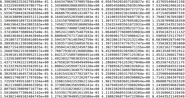
I understand: Nothing.
On the other hand, when we choose a proper visualization technique, the important things become clear.
I see:
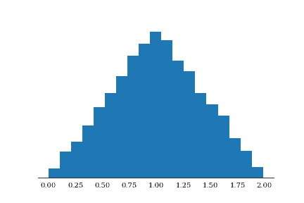
I understand: It’s a triangle! (And the top is at 1.00)
It’s worth remembering that what we are after is insight during the entire visualization workflow – starting with data transformations, and ending with the choice of file format to save the images.
2. Setup
Installation
Assuming you have your python development environment set up, install matplotlib using the Python package manager of your choice. If you don’t use one, start now! I highly recommend the Conda package manager that you can get by installing miniconda.
$ conda install matplotlibin terminal or windows PowerShell will install matplotlib and all the dependencies. If you use pip
$ pip install matplotlibwould do the job.
Backends and interaction setup
Matplotlib supports multiple backends – a concept that might be confusing for new users. Matplotlib can be used for many different things, including saving the visualizations results of long-running calculations for later review. These use cases are non-interactive and use the so-called hardcopy backends. If your matplotlib came preinstalled, it might be using one of the hardcopy backends by default. In this case, you won’t see anything when issuing plotting commands.
In this tutorial, we’ll use matplotlib interactively to see the results of our actions immediately. This means that we need to use a user interface backend. If you installed matplotlib yourself, the default backend would be chosen to match one of the supported GUI frameworks, such as Qt, WxWidgets, or Cacao – which is available on your computer. Tcl/Tk framework and its programming interface TkInter comes alongside with most python installations. To stay on the safe side, we’ll use TkInter backend, as you’re almost guaranteed to have it.
import matplotlib as mpl

mpl.use('TkAgg') #Use TkInter backend with anti-grain geometry renderer
These statements must come before we import pyplot, as otherwise they will have no effect, since the default backend would be chosen during pyplot import.
If we were to use only the commands above, we would have to call pyplot.show() every time we wanted to see our plots. What’s worse, is that we would not be able to enter any python commands until the figure window is closed. To be able to interact both with the plots and with Python, we need to turn on the interactive mode:
import matplotlib.pyplot as plt

plt.ion() # turn on interactive mode
To test the setup type this at python prompt:
>>> plt.text(0.0 , 0.5, 'Hello World!')This should open a figure window with an Axes and a Text object saying “Hello World!”. Close this window manually using the mouse or enter plt.close() in the interpreter.
Jupyter notebook
If you are using a (properly configured) Jupyter notebook, you may skip the above setup, as you will have your figures rendered in the output cells of the notebook. Just make sure to input all the code from each block in our examples into a single Jupyter cell.
3. Visualization techniques
We see in 2D
Our eyes’ retina is a thin sheet with light-sensitive photoreceptor cells. The relative positions between photoreceptors change very slowly over our lifetime and can be thought of as pretty much constant. Two numbers and a reference point on the retina are enough to find any given light-sensitive cell, making our sight essentially two-dimensional.
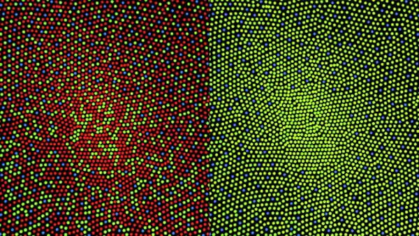
Retinal mosaic: distribution of red, green and blue photoreceptor cells in the center of retina of a person with normal vision (left) and a color-blind person (right). Image by Mark Fairchild under Creative Commons Attribution Share-Alike 3.0 License.
But what about stereo vision? After all, we do live in a three-dimensional world.
While we may live in a 3D world, we never actually see all of it. We don’t see inside objects – otherwise, we wouldn’t we need X-ray or ultrasound machines. What we see with our eyes are just the surfaces of the objects, and those are two dimensional.
Data, on the other hand, can have any number of dimensions. The best way for us, humans, to understand data is to examine its two-dimensional representation. In the rest of this tutorial, we’ll go through the basic techniques to visualize data of different dimensionality: 1D, 2D and multidimensional data.
1D Data
Statistical distributions are a typical example of 1D data. What you want to do is transform your data so that you have another dimension. By far, the most common way to do this is to categorize data and count the frequency of items in the categories. In the case of continuous distributions, categories can be defined by splitting the data range into equally sized intervals. This is the well-known histogram.
Let’s generate some normally distributed data and see which values are most commonly seen. We start by importing the Numpy package: it’s one of matplotlib’s main dependencies and should have been installed by the package manager.
import numpy as np

data = np.random.randn(10000)

fig, ax = plt.subplots()

ax.hist(data,bins=20)

fig.suptitle('Histogram of a sample from standard normal distribution')

ax.set_ylabel('counts')

fig.savefig('1_histogram.png', dpi=200)
I see:
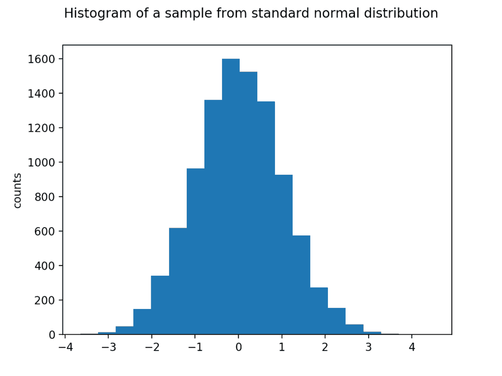
I understand: values around 0 are the most common. Full width at half-maximum is about 3.
The hist() function above calls numpy.histogram() under the hood to count the number of data points in respective bins. For categorical or integer variables you will have to do your own counting and call the bar() function.
For example:
responses = [

 'chocolate', 'chocolate', 'vanilla', 'chocolate', 'strawberry', 'strawberry','chocolate', 'vanilla', 'vanilla', 'chocolate', 'strawberry', 'chocolate', 'strawberry', 'chocolate', 'chocolate','chocolate', 'chocolate', 'strawberry', 'chocolate', 'strawberry', 'vanilla', 'vanilla', 'chocolate', 'chocolate', 'strawberry', 'chocolate', 'strawberry', 'vanilla', 'chocolate', 'chocolate', 'chocolate', 'strawberry'

]

flavors, counts = np.unique(responses, return_counts=True)

fig, ax = plt.subplots()

plt.bar(flavors,counts)

ax.set_ylabel('counts')

fig.suptitle('Ice-cream preference')

fig.savefig('2_bar.png', dpi=200)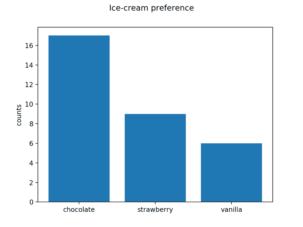
I understand: chocolate ice-cream tastes the best.
2D Data
Scatter plot for measurements
For this demo we will use a small real world dataset. Please head to Kite’s Github Repository and download the files ‘data.csv’ and ‘truth.csv’ if you want to follow along!
When measuring a dependence between certain quantities, a scatterplot is a good way to visualize it. scatter() accepts x and y positional arguments representing the coordinates of each marker, followed by an optional size and color arguments that specify appropriate properties for each marker.
# Load data

measurements = np.loadtxt('data.csv')

print(measurements)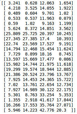
fig, ax = plt.subplots()
sc = ax.scatter(measurements[:, 0],
measurements[:, 1],
measurements[:, 2],
measurements[:, 3])
plt.colorbar(sc)
plt.title("Axes.scatter() demo")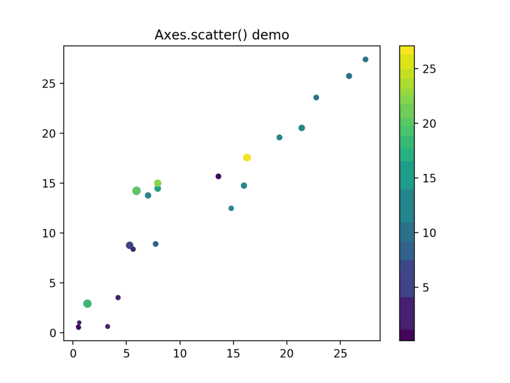
Joint bivariate distributions
Another type of two dimensional data are bivariate distributions. Density of bivariate distributions can be easily visualized using a scatter with translucent markers.
x = 2*np.random.randn(5000)
y = x+np.random.randn(5000)
fig, ax = plt.subplots()
_=ax.scatter(x,y,alpha = 0.05)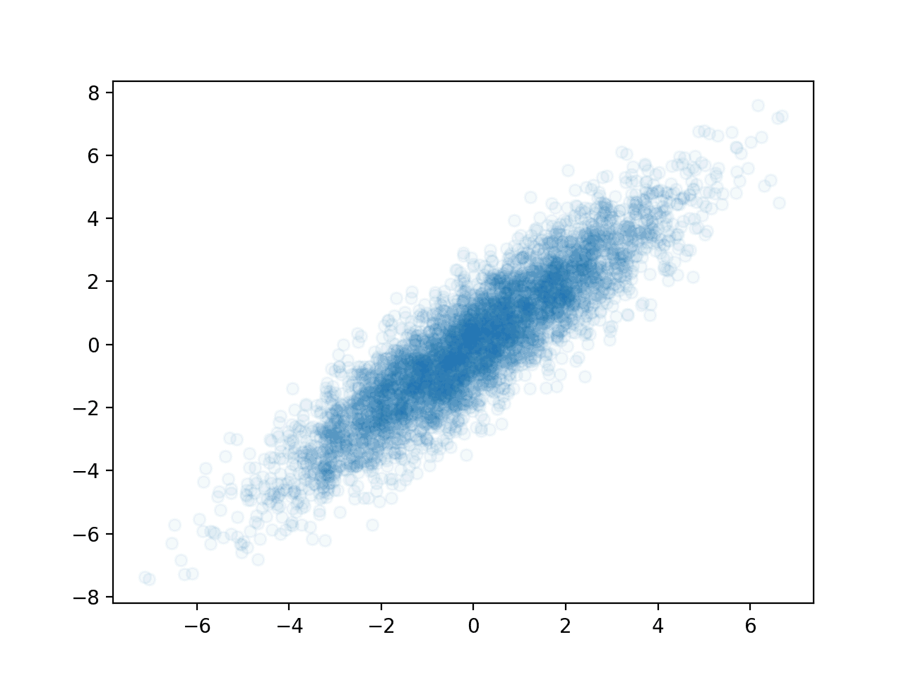 Another way to represent the same data is with a two-dimensional histogram. This might be preferred for smaller samples.
fig, ax = plt.subplots()

_=ax.hist2d(x[::10],y[::10])

ax.set_title('2D Histogram')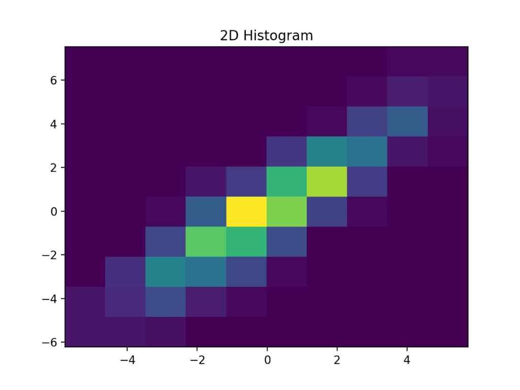
Hexbin provides a slightly more aesthetically pleasing result.
fig, ax = plt.subplots()

_=ax.hexbin(x[::10],y[::10],gridsize=20,cmap = 'plasma')

ax.set_title('Hexbin Histogram')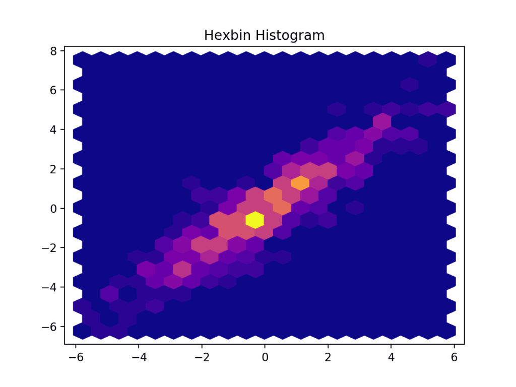
The optional cmap argument sets a colormap for the plot. A list of all built-in colormaps can be found here.
While Matplotlib also supports contour plots, building the contours from the sample requires additional processing. Seaborn and other add-on libraries provide functions that achieve the desired effect in a single line of code.
Images
Matplotlib can display images represented as arrays of shape (n,m), (n,m,3) or (n,m,4). The first case is interpreted as a grayscale image, the second as an RGB image, and the third as an RGB image with an alpha channel. Let’s make some nice gradients:
im = np.zeros((800,600,3))

im[:,:,0] = np.linspace(0,1,800)[:,None]

im[:,:,1] = np.linspace(0,1,600)[None,:]

im[:,:,2] = np.linspace(1,0,600)[None,:]

plt.imshow(im)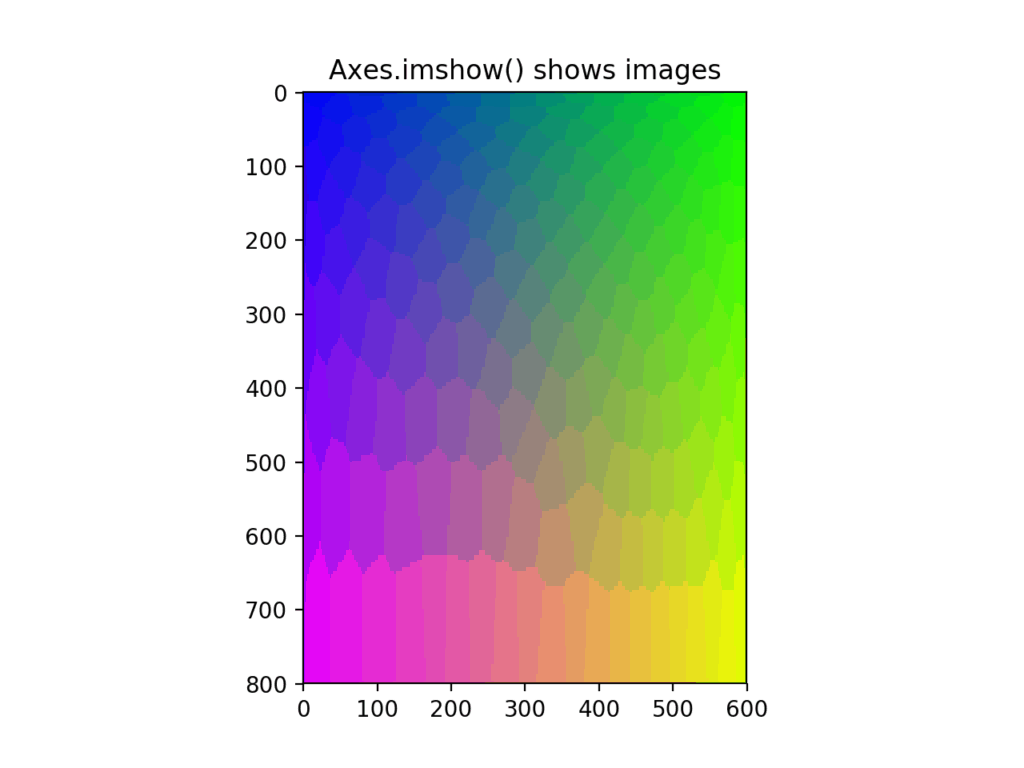
Mathematical functions
We have already seen how to set titles, legend, xlabel and ylabel for the axes, and add text annotations. All these functions can render mathematical notations in latex syntax. This is as easy as placing the necessary latex commands within “$” characters. In this example, we will plot a mathematical function and use fill_between to highlight the area under the curve.
… # same imports as previous examples
x = np.linspace(-1.,1.,1000)
y = -x*x+1.
fig,ax = plt.subplots()
ax.plot(x,y)
ax.fill_between(x,y,alpha=0.2,color='cyan') #highlight the area under the curve
ax.xaxis.set_ticks_position('bottom')
ax.yaxis.set_ticks_position('left')
ax.spines['left'].set_position('zero') # makee x and y axes go through
ax.spines['bottom'].set_position('zero') # the origin
ax.spines['right'].set_color('none') # hide the unnecessary
ax.spines['top'].set_color('none') # spines ("the box" around the plot)
ax.set_xlabel('x',fontdict={'size':14})
ax.xaxis.set_label_coords(1.0, 0.0)
ax.set_ylabel('y',rotation=0,fontdict={'size':14})
ax.yaxis.set_label_coords(0.55, 0.95)
#render latex formulas in the title
ax.set_title('$\\int_{-1}^{1}(1-x^2)dx = 1\\frac{1}{3}$',fontdict={'size':28}) 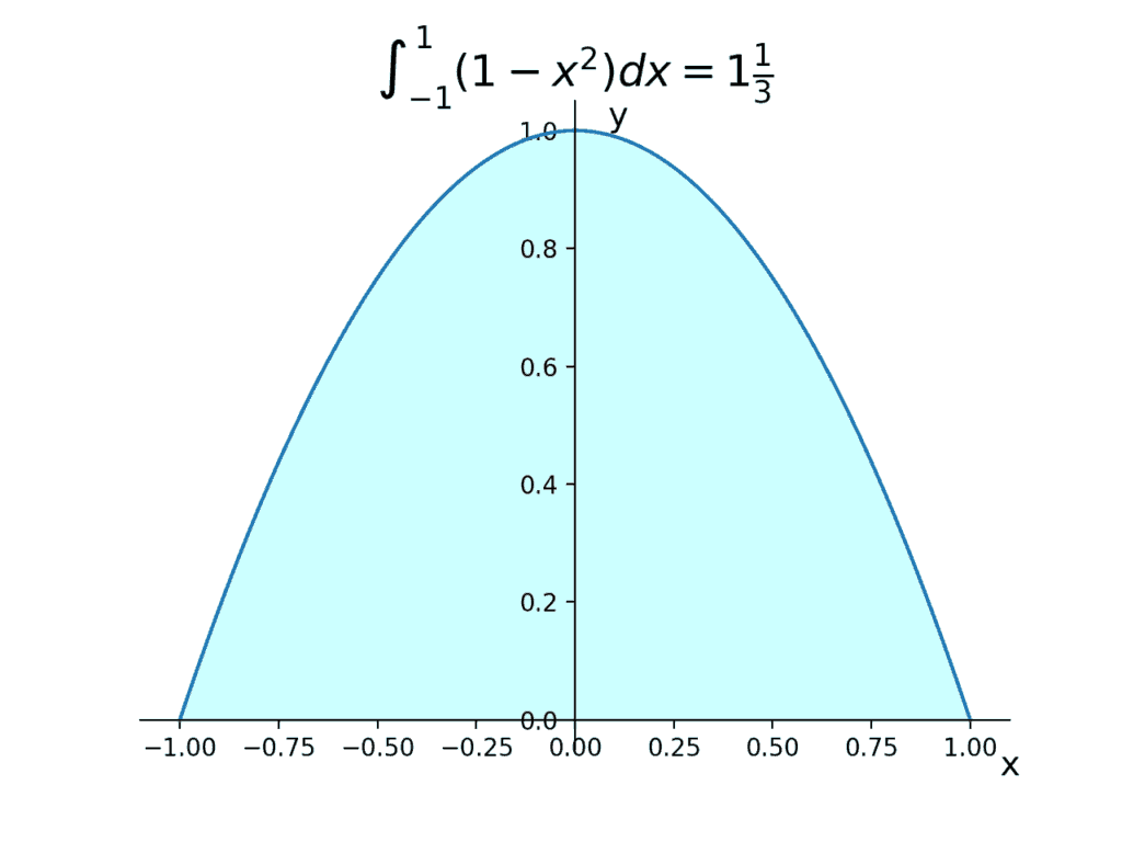
When using matplotlib to prepare figures for a scientific paper, the default style of mathematical formulas rendered by matplotlib might not match the publisher’s style. To fix this, matplotlib can offload math rendering to an existing TeX installation. This demo shows how to achieve this.
Multi-dimensional data
With multidimensional data, the task is transforming it into one or several two-dimensional representations. Generally this leads to a loss of information, but that’s actually the point: we want to omit all the irrelevant details and highlight the big picture, or some particular aspect of the data.
Finding the data representation that makes sense for us is at the core of Data Analysis – a vast subject area that goes beyond the scope of this post. However, in certain simple cases, depending on the structure of the data, we might be able to visualize interesting features of the data without transforming it.
For example, the data we loaded previously is actually the result of measuring the same quantity in the same objects using four different measurement methods. The truth.csv file contains reference values for this quantity. So without losing any information, we may plot each column of our data versus the reference values overlaid on top of each other.
Adding overlays on the existing axis is as easy as calling additional plot methods.
… # same imports as previous examples
x = np.linspace(-1.,1.,1000)
y = -x*x+1.
fig,ax = plt.subplots()
ax.plot(x,y)
ax.fill_between(x,y,alpha=0.2,color='cyan') #highlight the area under the curve
ax.xaxis.set_ticks_position('bottom')
ax.yaxis.set_ticks_position('left')
ax.spines['left'].set_position('zero') # makee x and y axes go through
ax.spines['bottom'].set_position('zero') # the origin
ax.spines['right'].set_color('none') # hide the unnecessary
ax.spines['top'].set_color('none') # spines ("the box" around the plot)
ax.set_xlabel('x',fontdict={'size':14})
ax.xaxis.set_label_coords(1.0, 0.0)
ax.set_ylabel('y',rotation=0,fontdict={'size':14})
ax.yaxis.set_label_coords(0.55, 0.95)
#render latex formulas in the title
ax.set_title('$\\int_{-1}^{1}(1-x^2)dx = 1\\frac{1}{3}$',fontdict={'size':28}) 
The third argument in a call to plot() above is the format specifier string. This is a convenient way to set the style of the plot. In this example, the first character ‘o’ tells matplotlib to use circular markers, and the second character ‘:’ tells it to connect the marker with a a dotted line. Other options are ‘:’,’–‘,’-.’ for dotted, dashed, and dot-dashed lines respectively. The list of all marker specifiers can be found here. It’s also possible to specify color this way by adding another character, for instance, ‘r’ for ‘red’. Color options are ‘g’,’b’,’c’,’m’,’y’, and ‘k’ for green, blue, cyan, magenta, yellow, and black, respectively.
The result in the previous example can be obtained by supplying the the entirety of the measurements variable to the plot method. Matplotlib would cycle through the last dimension of the data and overlay the plot using a new color.
fig, ax = plt.subplots()

ax.plot(truth,measurements,'o:')

ax.set_ylabel('Measurements')

ax.set_xlabel('Reference')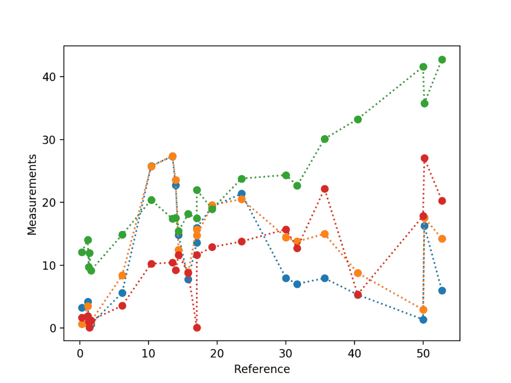
The colors are assigned according to the default properties cycle – a property of the Axes object. Below, we use non-default color cycle by setting the property cycle for the axes before calling plot().
fig, ax = plt.subplots()

n = measurements.shape[1]

ax.set_prop_cycle('color',plt.cm.viridis(np.linspace(0, 1, n)))

ax.plot(truth,measurements,'o:')

ax.set_ylabel('Measurements')

ax.set_xlabel('Reference')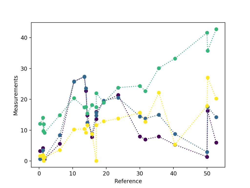
The figure above is quite messy, and it would be more understandable if the plots were positioned side by side. This is done with additional arguments to subplots(): we can create several axes arranged in a regular grid within a single figure.
The grid size is specified as integers in the first two arguments to subplots. Alternatively, one can supply a tuple of vertical and horizontal grid dimensions as a first argument. Keep in mind that in this case, subplots() returns an array of axes instead of a single axes object as the second element of its output.
fig, ax_array = plt.subplots(2,2,sharex = 'all', sharey = 'all') #ax_array is 2 by 2

for i in range(measurements.shape[1]):

   ax_index =np.unravel_index(i,ax_array.shape) # unravel index to cycle through subplots

              # with a single loop

   ax_array[ax_index].plot(truth,measurements[:,i],'o',label='method '+str(i))

   ax_array[ax_index].plot(truth,measurements[:,i],':')

   ax_array[ax_index].legend()

plt.suptitle('Subplots demo')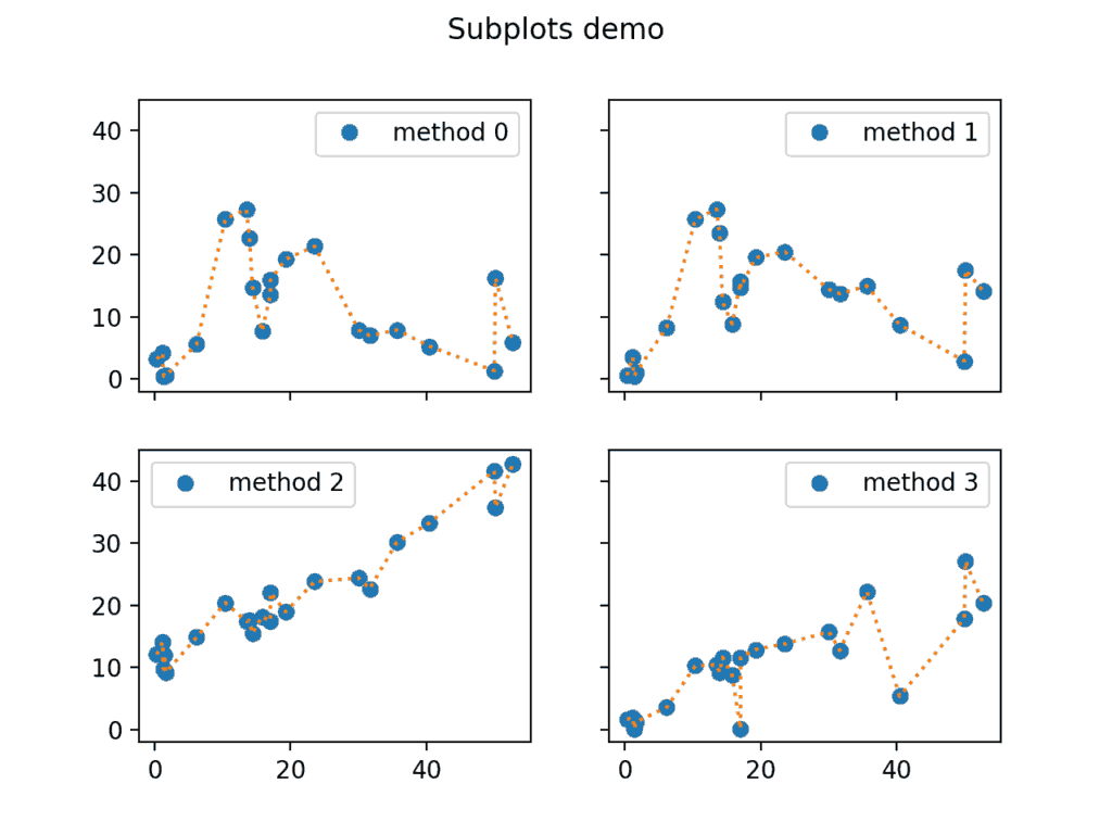
Note the sharex and sharey arguments in the call to subplots() above. This way, we ensure that the limits on the x and y axes are the same between all subplots.
Saving
Saving the rendered visualizations is as simple as a call to savefig() method of the Figure object. Matplotlib will infer the file format from the extension, and you can choose the output resolution for the bitmap formats using the dpi keyword argument:
fig.savefig('Figure.png', dpi=200)

fig.savefig('Figure.svg') # will use SVG vector backend
If you ever happen to lose track of the Figure object, use plt.savefig() to save the active figure.
4. Conclusion
To conclude, matplotlib is an excellent library for exploratory data analysis and publication quality plotting. It’s won its popularity by offering an easy-to-use procedural interface through a pyplot state machine. At the same time, it also allows to control all aspects of plotting for advanced visualizations through its main object-oriented interface, which facilitates the creation of maintainable, modular code.
Because it is so easy to start using matplotlib, it’s almost universally taught as the first graphics library in universities, so it’s safe to say it won’t be going anywhere soon. That being said, matplotlib is quite old and might feel clunky at times. Add-on libraries such as seaborn try to smooth the rough edges of matplotlib by offering an arsenal of advanced visualizations out of the box, better default settings, and extended procedural interfaces to aid with the more common tasks encountered during fine-tuning the appearance of the plots.
To see more examples of what matplotlib and seaborn are capable of, take a look at the galleries on their respective official websites.
https://matplotlib.org/gallery.html
https://seaborn.pydata.org/examples/index.html
The best place to look for answers on matplotlib is in Stack Overflow – it has hundreds of answered questions and you can always ask your own. That said, I personally recommend scanning through the list of all pyplot plotting commands available here before any search, just to know what’s out there. Did you know that you can draw xkcd-style plots with matplotlib?
Happy plotting!
This post is a part of Kite’s new series on Python. You can check out the code from this and other posts on our GitHub repository.
Resources
 in San Francisco

